Introducing UberGrid
We strive to keep posts updated, but code samples may sometimes be outdated. Humans, see the Bryntum documentation; agents, https://mcp.bryntum.com for the latest info.
Introduction
We’re proud to present the new UberGrid component – a grid with super powers for Sencha Touch! UberGrid aims to support as many grid features as possible while also providing excellent performance on a wide range of mobile devices.
The UberGrid is the latest member of our product family. It already serves as the base component for another of our products – the Touch Scheduler. We decided that the two products would benefit from a clean separation of logic – the scheduler just uses the grid API and doesn’t need to worry about the underlying grid implementation. The grid on the other hand – will not “know” anything about scheduling, thus remaining an isolated and general-purpose grid.
The UberGrid is mainly targeted at tablet devices and ‘phablets’, since grids normally display a lot of information. There is of course nothing preventing you from using it on a supported smartphone though.
Features
For the initial 1.0 release, the UberGrid supports:
-
Grouped column headers
The columns in the UberGrid can have sub-columns and form groups. There is no limit on the number of nesting levels.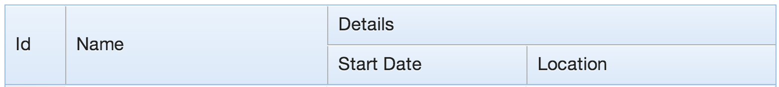
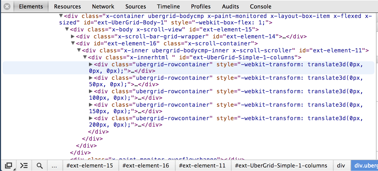
- Buffered rendering
UberGrid supports a special rendering mode in which only the rows visible in the viewport are included in the DOM. In this mode, the UberGrid offers a flat performance for any number of rows in the data set. For small data sets, you can just use the default non-buffered rendering mode which provides the best possible scrolling experience. See the below DOM footprint for a grid with a viewport fitting 5 rows, while having 100s of records in its store.
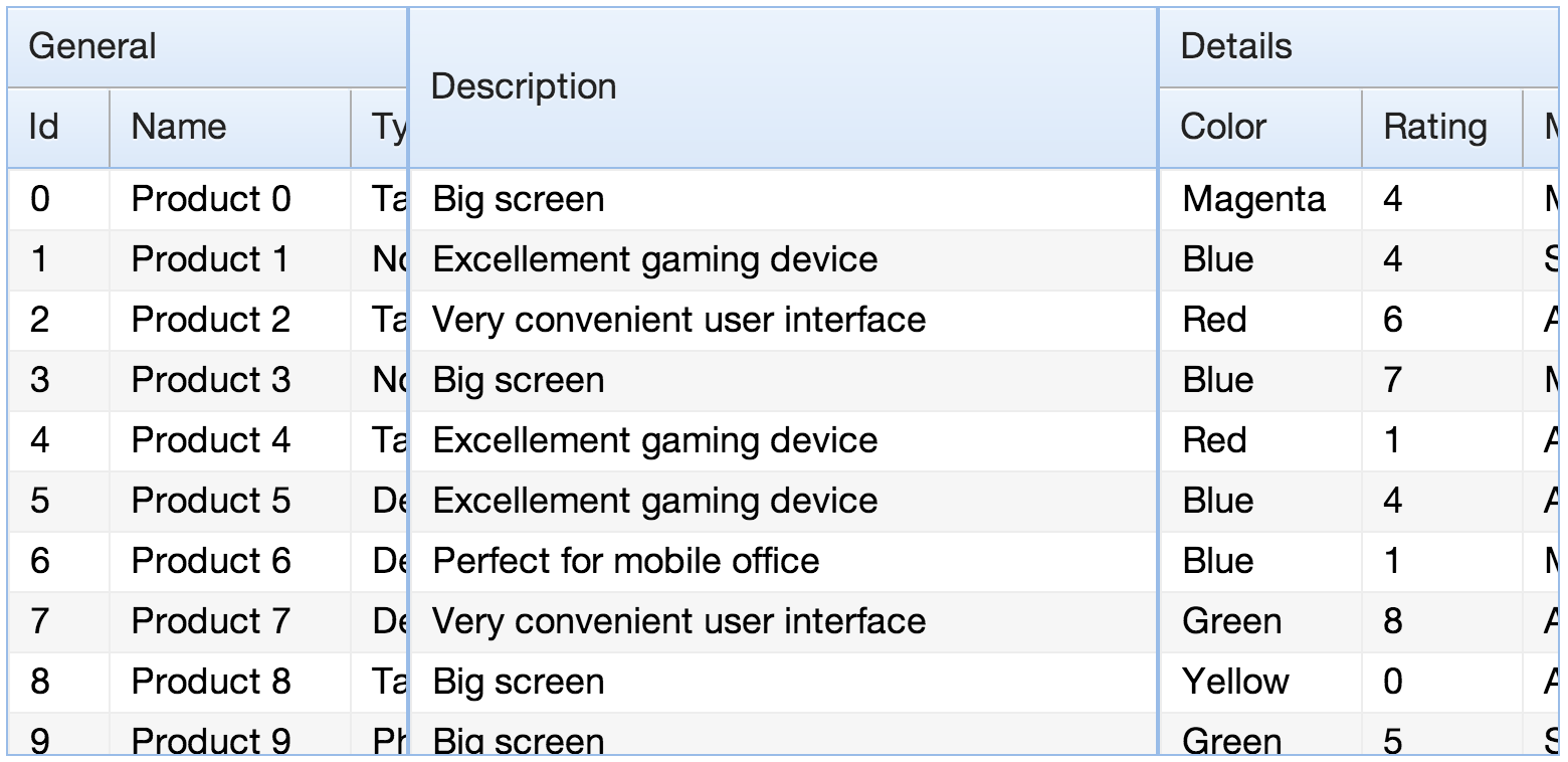
- Unlimited number of locked sections
The UberGrid can have several “locked” sections on the left or the right side of the main content area. In the image below, there is a scrollable section on both sides.
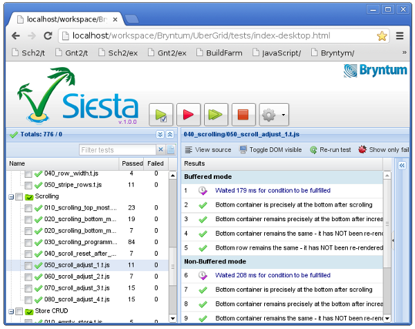
- Unit tested with Siesta
Code stability is a feature. The UberGrid is covered with unit and functional tests and the test suite is included in the package. We run the test suite nightly and before every release. This makes sure we won’t accidentally break old features in new releases and any bugs found should only be reported once – as each bug introduces a new test case. You can count on the public (documented) API to remain stable in future releases.
- And there’s more…
UberGrid also supports variable row height, column sorting, customizable data rendering, customizable header rendering and more. We’ll cover these features in a more technical blog post coming soon.
Getting started
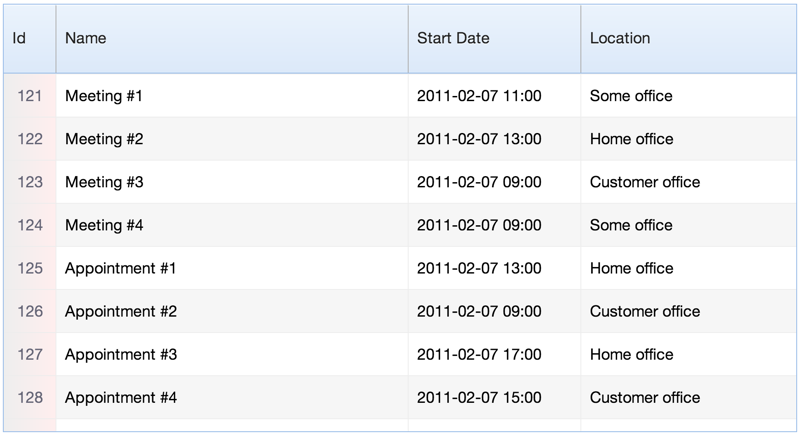
The component provides an API which is very similar to the Ext JS grid panel. UberGrid is a subclass of the `Ext.Container` class and can participate in any Sencha Touch layout. To create a grid you simply instantiate the `UberGrid.Panel` class:
Ext.define('Meeting', {
    extend : 'Ext.data.Model',

    config : {
        fields : ['Id', 'Title', 'StartDate', 'Location']
    }
});

Ext.setup({
    onReady: function () {
        var grid = new UberGrid.Panel({
            margin              : 20,
            rowHeight           : 50,

            columns             : [
                {
                    header      : 'Id',
                    dataIndex   : 'Id',
                    width       : 60,
                    cellCls     : 'id'
                },
                {
                    header      : 'Name',
                    dataIndex   : 'Title',
                    flex        : 1
                },
                {
                    header      : 'Start Date',
                    dataIndex   : 'StartDate',
                    width       : 200
                },
                {
                    header      : 'Location',
                    dataIndex   : 'Location',
                    width       : 250
                }
            ],

            store : new Ext.data.Store({
                autoLoad    : true,
                model       : 'Meeting',
                proxy       : {
                    type    : 'ajax',
                    url     : 'data.js',
                    reader  : { type : 'json' }
                }
            })
        })

        Ext.Viewport.add(grid);
    }
});
This example should be pretty self-explanatory. The required configs are `columns` and `store`. To dive deeper into the details, please see the getting started guide in the docs.
Roadmap
This is only the initial 1.0.0 release. We’ll keep adding new features with every new version. Among the nearest ones will be grouping, data index, columns resizing and later tree support. If a particular feature is important for you, let us know and we’ll try our best to add it!
Ready to try it out?
Here are some resources to get you going:
[list]
- Download a trial here
- Live examples (needs a Webkit browser)
- API docs
- Getting started guide
- “Learn Sencha Touch” at sencha.com
- Additional Sencha Touch resources
[/list]