Announcing Bryntum Suite 5.0
Today we are very happy to announce the new 5.0 release of our Bryntum web component suite, after more than a year of development. It is packed with new features as well as cool new demos, and in this post I will give an overview of the biggest enhancements. We also have a number of in-depth technical feature posts on the way.
Also, don’t miss our March 16th upcoming webinar where you will get a live demo of all the new features.
Improved external drag drop
One of the most frequent topics of our support forums and pre-sales calls involve dragging tasks or objects from an outside grid onto the timeline. We decided to refactor, simplify and polish our drag utility and in 5.0, dragging from and to external sources is so much easier to implement. The existing drag-drop demos have been updated and a few new ones were added:
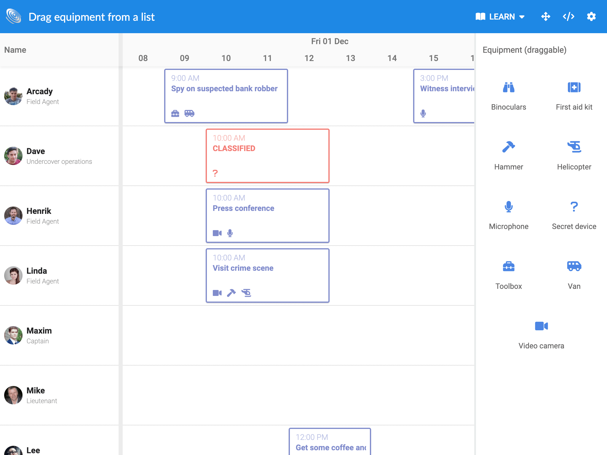
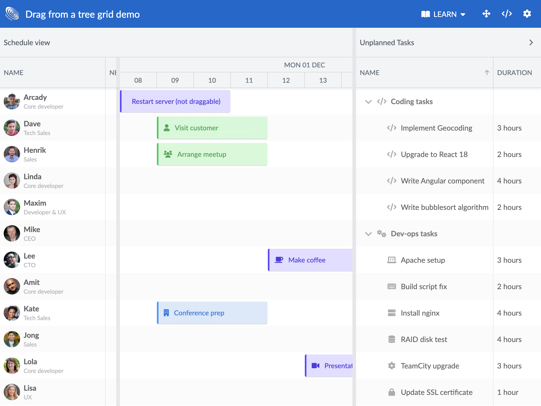
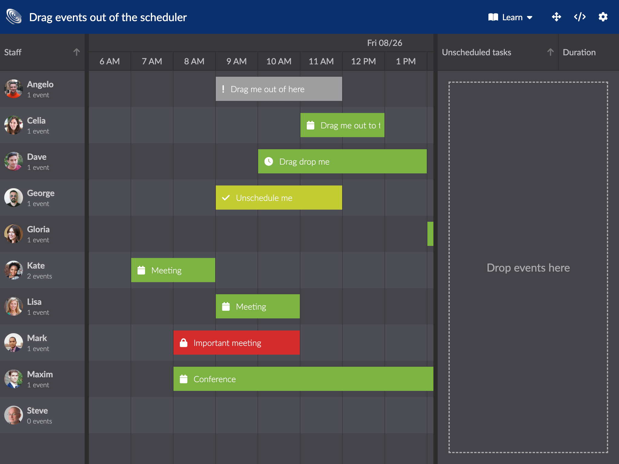
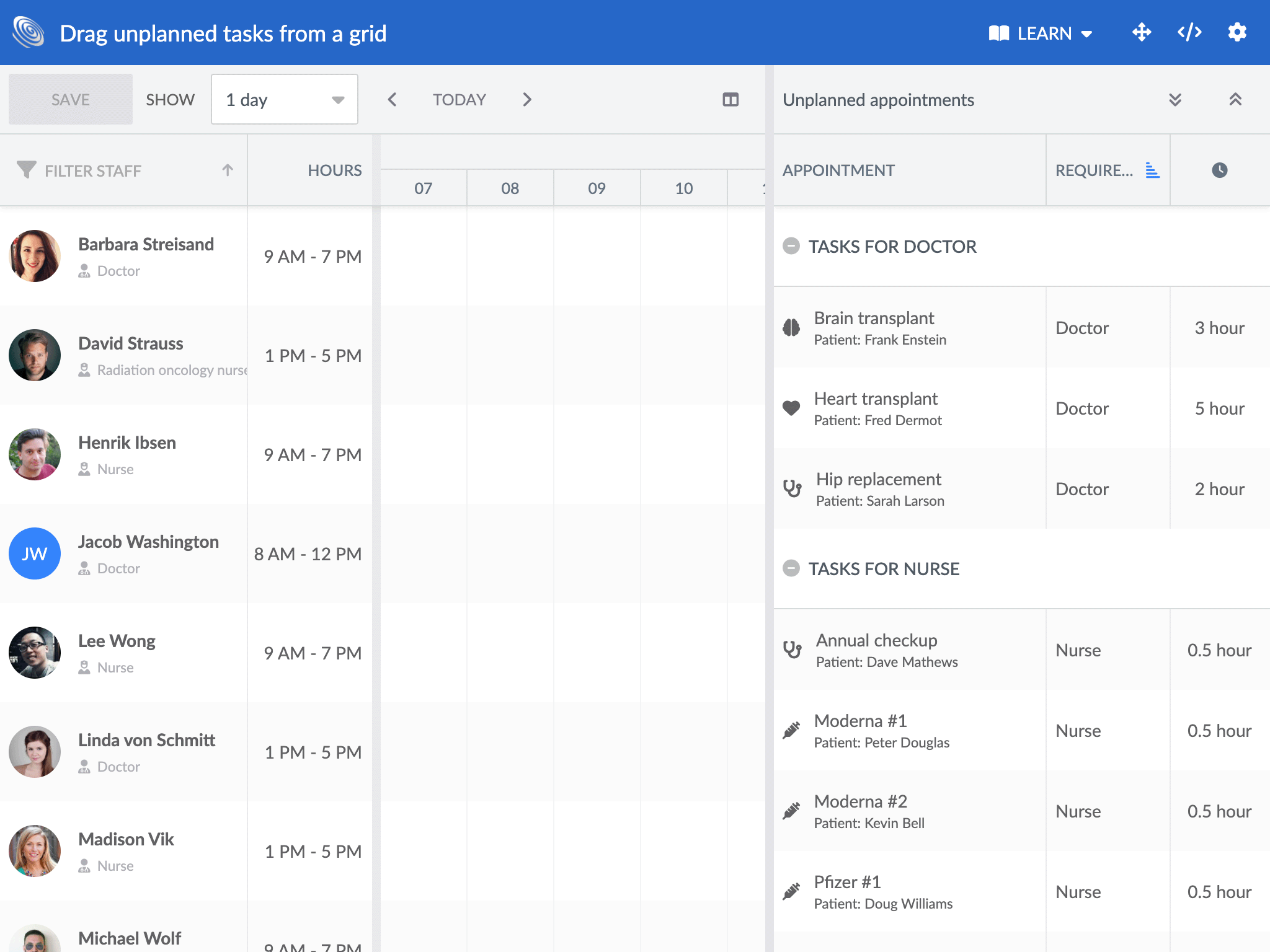
We have also made guides showing you how to implement these drag-flows, you can find them here:
- Scheduler drag events from a Grid
- Gantt drag tasks from a Grid
- Gantt assigning resources by dragging from a Grid
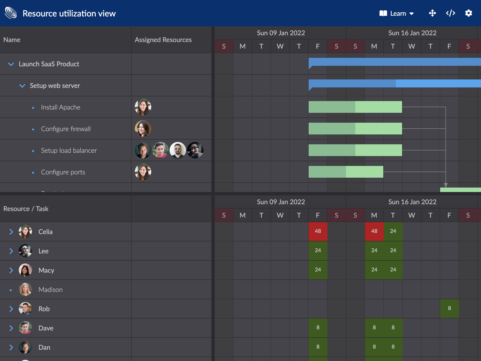
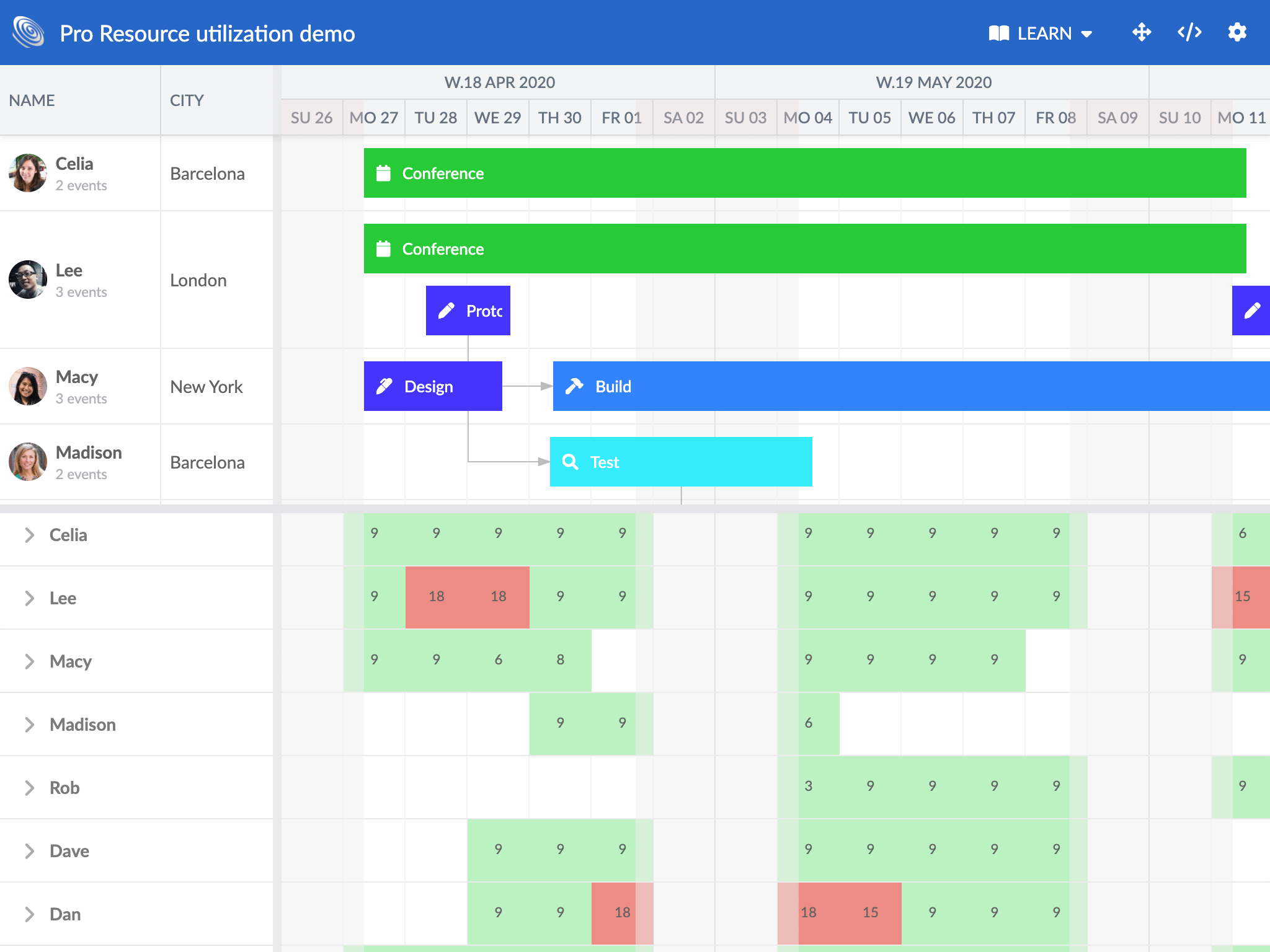
New Resource Utilization widget
In Scheduler Pro and Gantt, there is a a new ResourceUtilization widget showing the resource utilization broken down by task and time unit. This is a very useful visualization when trying to avoid resource overallocation. To learn more, please refer to the API docs or try one of the new demos:
New conflict resolution UI
Scheduler Pro and Gantt now display a popup informing users of scheduling conflicts, cycles and calendar misconfigurations. The popup allows the user to pick an appropriate resolution for the case at hand. Try it out by clicking the button in this live demo:
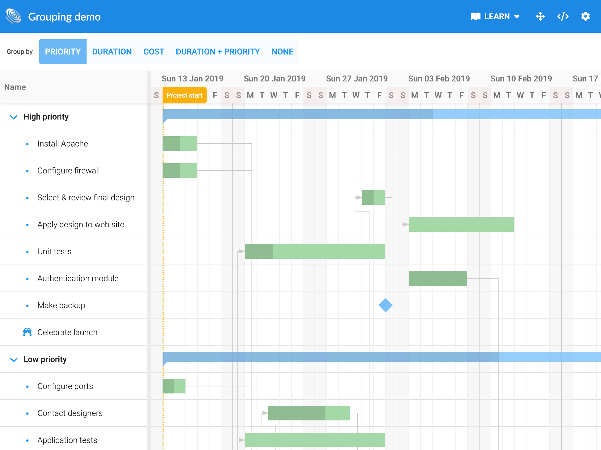
Tree grouping feature
The Grid component has a new TreeGroup feature that can transform both flat and hierarchical datasets into new trees. The parent levels in the new tree are determined by each record’s values for an array of fields (or functions). Below you can see a simple example which yields a tree with two parent levels where the first level is grouped by the city field value and the second level is grouped by age.
const tree = new TreeGrid({
    appendTo : 'container',

    features : {
        treeGroup : {
            levels : ['manager', 'airline']
        }
    }
});
The result can be seen in this image, you can also regroup the treegrid data programmatically anytime.
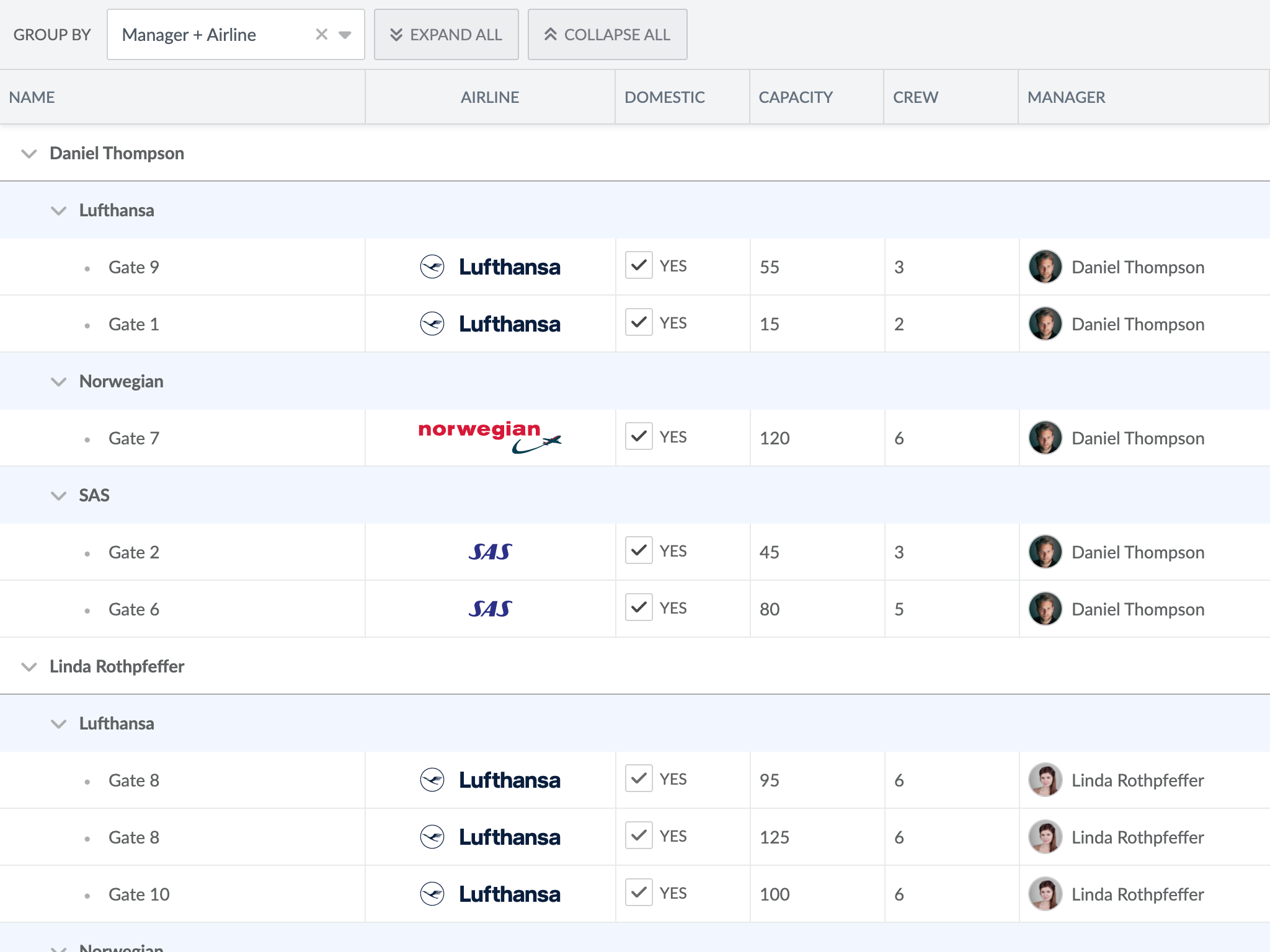
Note that the generated parents are read-only. This feature is also supported by the Gantt, click the image to try it out.
Performance improvements
In 5.0, the time to initial render of events and tasks in Scheduler Pro and Gantt has been drastically improved. Previously, we delayed the initial render until the engine had normalized and corrected all the schedule data. In the latest release, we now render the initial data immediately and let the engine continue in the background. You can compare the previous approach to the new in this Gantt demo.
Parent area highlight feature
We added a new feature to our Gantt chart called ParentArea that highlights the area encapsulating all child tasks of a parent. See it in action in the new parent-area demo or try it in this live demo:
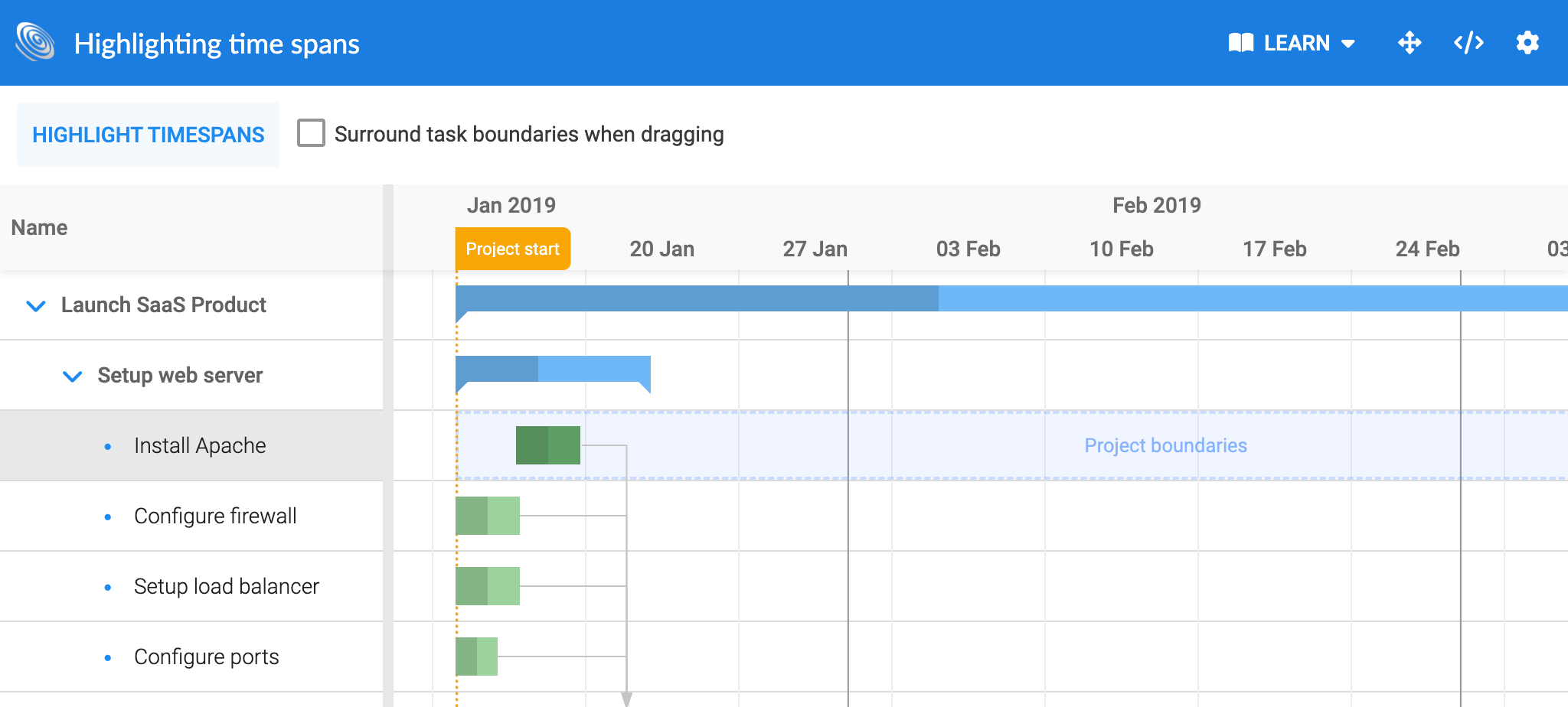
Visualizing calendars and time spans
The Gantt and Scheduler Pro both contain lots of data relating to availability of resources and tasks, data which is important for the end user to see and understand. If an end user is not able to drag a task to a certain place, there needs to be a clear UI revealing the reasons. We therefore added multiple new features and demos to help you visualize the detailed rules of your schedule & project in Scheduler Pro and Gantt.
The new TimeSpanHighlight feature allows you to temporarily highlight any time span in the schedule. In the new highlight-time-spans demo in Gantt it is used to show the project boundaries when dragging a task:
This feature also greatly improves the user experience when you reschedule tasks in the Scheduler Pro. You will see how in the highlight-time-spans demo, which shows a parcel delivery schedule where each parcel needs to be delivered in a specified time slot, that is highlighted when dragging events.
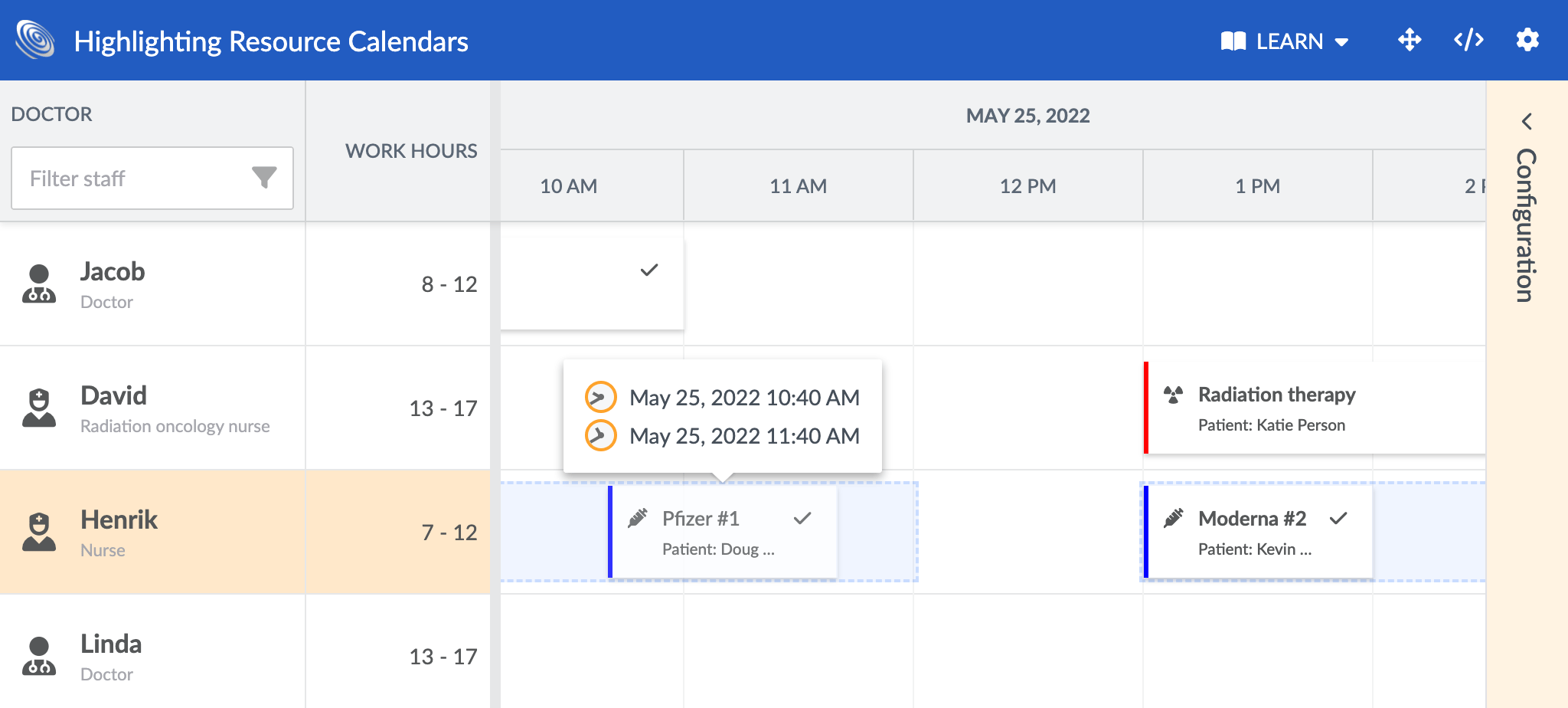
Scheduler Pro also has a new CalendarHighlight feature that lets you visualize the availability calendar of a resource or an event. We made two new demos to show this off, below you can see the highlight-resource-calendars demo highlighting resource calendars:
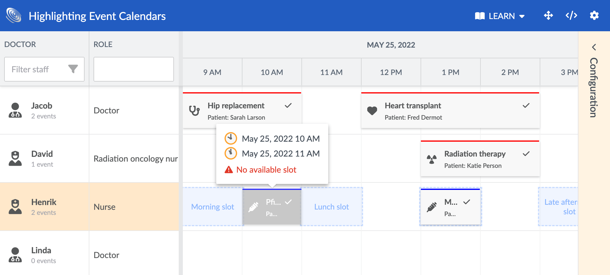
And the highlight-event-calendars showing how to highlight event calendars:
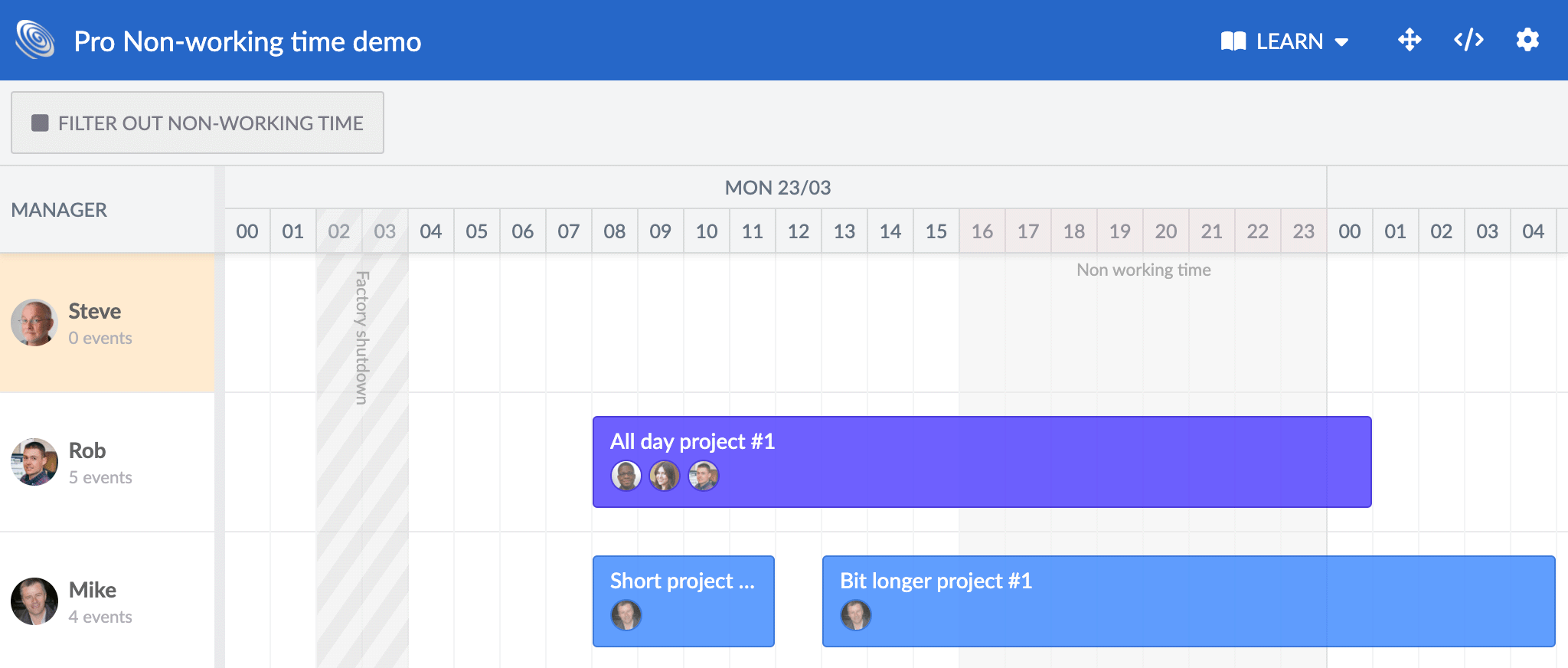
It is now also possible to customize how non-working intervals are visualized. You can do this easily by adding either a CSS class or a name to the calendar intervals in your data. See this in action in the updated non-working-time demo in Scheduler Pro:
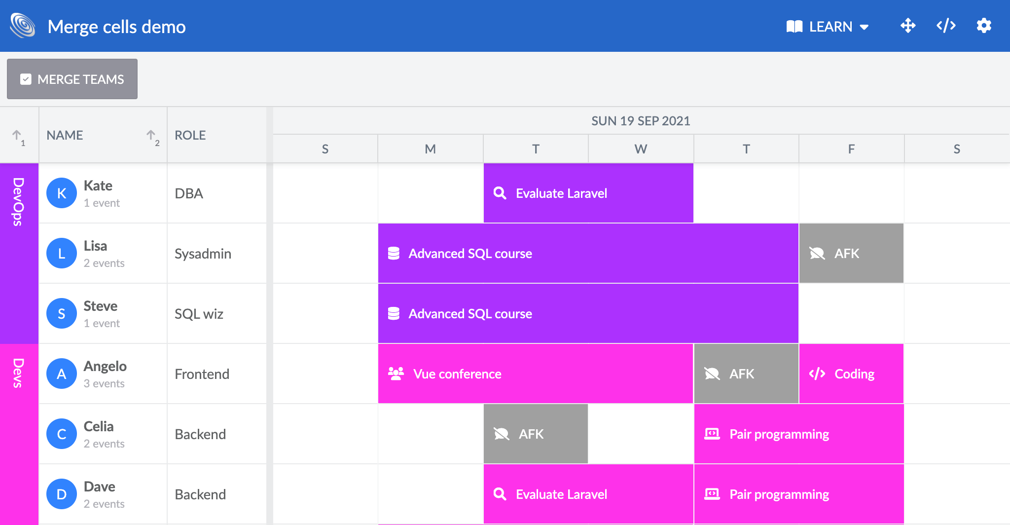
Merge cells / row span feature
Grid has a new MergeCells feature that can merge cells between rows containing the same value in a column by which the Grid is sorted, essentially creating row spanning cells. It can also be used in Grid-based products such as Scheduler, as shown in this new merge-cells demo:
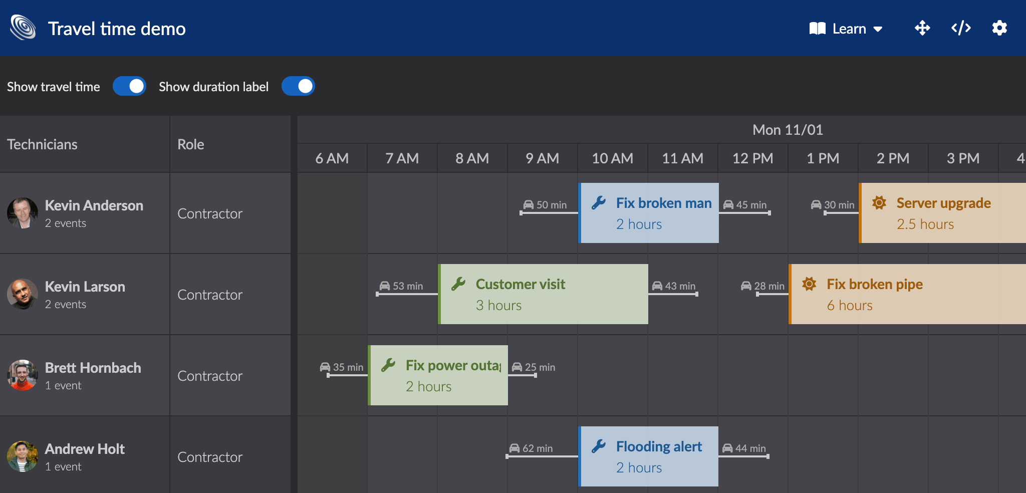
Travel time / event buffer
One of the most popular requests over the last few years is the ability to define a timespan before and after an event takes place. In a field service type application, technicians typically need to travel to get on site before doing the work. In a factory, a machine might need to be prepared before and cool down after a job. The new EventBuffer feature in Scheduler Pro lets you visualize concepts such as travel time or setup and teardown time very easily. Try it out in the new travel-time demo:
const scheduler = new SchedulerPro({
    appendTo : 'container',
    features : {
        eventBuffer : {
            showDuration    : true,
            tooltipTemplate : ({ duration }) => `Travel time: ${duration}`
        }
    }
});
Combining multiple Bryntum components
In 5.0 we have greatly simplified how to combine multiple Bryntum components in the same app by introducing thin bundles for both JavaScript and CSS. The difference between thin bundles and our old bundles are that the thin bundles only have product specific code, letting you combine multiple products without having shared code downloaded multiple times. This approach also ensures there is only a single version of a class available, avoiding some of the pitfalls of combining the old bundles. This snippet illustrates the usage, old vs new:
// Old, all imports from a single bundle
import { Scheduler, DateHelper } from 'scheduler.module.js';

// New (optional), import from the correct products thin bundle
import { DateHelper } from 'core.module.thin.js';
import { Scheduler } from 'scheduler.module.thin.js';
Please note that using thin bundles is optional and if you are using a single Bryntum component there is less overhead using the old module bundles.
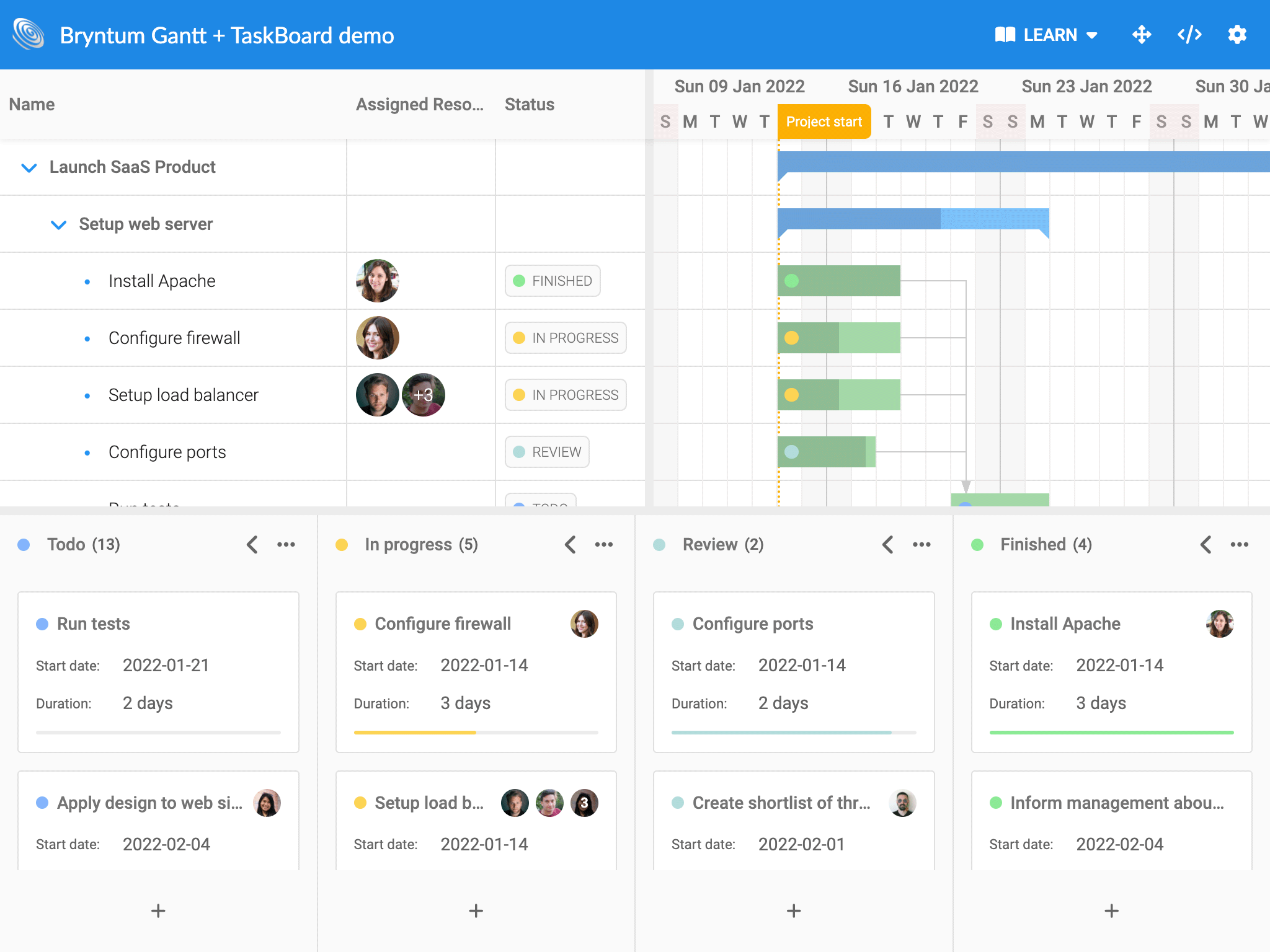
Thin bundles are used in a couple of new combination demos, and we plan to add many more moving forward. Try for example the new gantt-taskboard demo in Gantt:
Gantt ProjectModel in Angular, React & Vue
Another step towards simplifying combining multiple Bryntum products in the same app is the introduction of a separate ProjectModel component for Angular, React and Vue. It allows creating a single project and sharing it between multiple components in a similar way as one can in non framework apps. This snippet illustrates how it is done in React:
// Project holding all data
<BryntumProjectModel
    ref={project}
    calendars={calendars}
    tasks={tasks}
    assignments={assignments}
    dependencies={dependencies}
    resources={resources}
    timeRanges={timeRanges}
/>
// Gantt using the project
<BryntumGantt
    ref={gantt}
    project={project}
/>
There is a new demo named “inline-data” for each framework showing how to use it (and a new data binding guide per framework):
- Angular inline-data demo (Guide)
- React inline-data demo (Guide)
- Vue inline-data demo (Guide)
- Vue 3 inline-data demo (Guide)
React components now use ES module bundle
The React wrapper and accompanying demos now use the ES module bundle instead of the legacy UMD bundle. Aside from being a more modern approach, the bundle is slightly smaller and more performant. If you are using our React wrapper, you need to adjust your imports accordingly:
// 4.x imports from the umd bundle
import { TaskModel } from '@bryntum/react/gantt.umd.js';

// 5.x imports from the module bundle (which is the default bundle for the package)
import { TaskModel } from '@bryntum/react';
The Vue wrapper and demos already use the ES module bundle, and the plan is to move Angular over in v5.1. Please note that the UMD bundle will still be available but not used by default.
Test case extraction
When reporting a hard to reproduce issue to us in the Bryntum’s support forum, we often request a test case showing the issue. A good test case greatly reduces the time it takes from reporting the bug until a fix can be put in place and released.
To simplify the process of creating a test case, we have implemented a new function called downloadTestCase() to all Bryntum products. When executing it, all config values used by your app, and the current dataset are collected and compiled into a JavaScript app that we can run and debug.
The app will most likely require a little manual tweaking before you can submit it to us, but we are hoping it will make test case creation easier for you. Run grid.downloadTestCase() on the console in any Grid demo to try it. Any feedback on how this could be improved further would be appreciated!
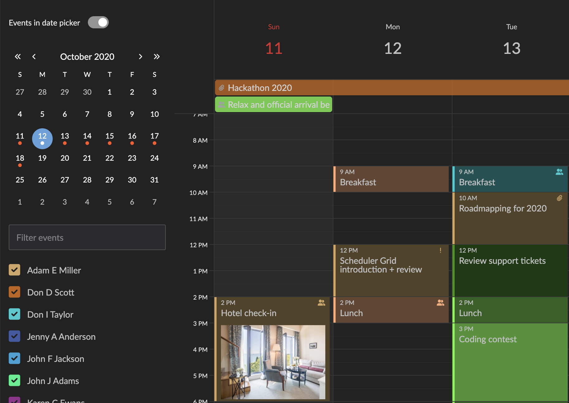
Calendar sidebar enhancements
The side bar date picker can now be configured with events to show a small bullet for day cells which contain events. This is useful for end users looking for an empty day, or vice versa.
calendar = new Calendar({
    // Show event presence as bullets in the date picker cells
    datePicker : {
        events : true
    }
});
In other news…
The release contains even more new features and improvements, such as:
- Events in Scheduler & Scheduler Pro are now absolutely positioned, allowing us to use native sticky behavior (cheaper)
- Records can now be made readOnly to prevent editing
- New Radio button and RadioGroup widgets
- Widgets can now automatically persist state changes
- The built in version of FontAwesome Free was upgraded to v6, which includes a few Bryntum sponsored Gantt icons used in the task menu (such as this one)
Release details
For full details on this release, please see the change logs, what’s new guides and upgrade guides of each product:
| Product | Changelog | What’s new | Upgrade guide | |
|---|---|---|---|---|
| Grid | ||||
| Scheduler | ||||
| Scheduler Pro | ||||
| Gantt | ||||
| Calendar | ||||
| TaskBoard |
Summing up
Version 5.0 brings lots of cool new features and demos you can use and learn from. Since this is a major release, we have also done some house cleaning and removed previously deprecated APIs. So be sure to check the changelogs and study the upgrade guides. The new features and examples we add are almost exclusively a result of the feedback received from our community. We hope you will enjoy these new features and please keep the feedback coming. For full details please see each product change log, links above.