Bryntum Grid
What is Bryntum Grid?
A versatile, high-performance data grid built with vanilla JavaScript, Bryntum Grid easily integrates with any backend or UI framework, including React, Vue, and Angular.
The easiest way to start using Bryntum Grid is by installing it using npm.
Get up and running quickly with a step-by-step guide:
Alternatively, follow our guide on installing Bryntum Grid without npm to download the distribution folder and import the Grid from the ES module bundle.
If you've purchased the licensed version, you can log in to the Bryntum Customer Zone to download Bryntum Grid, or access it directly through npm. The licensed distribution allows you to import only the classes you need directly from the source files, reducing the Grid's bundle size.
Sign up for a free 45-day trial to download the trial version of Bryntum Grid.
Live demo
Explore Bryntum Grid and test some of its features in the live demo.
For a complete overview of Bryntum Grid capabilities, explore the topic-specific guides in the menu, visit our API documentation, and browse Bryntum Grid examples.
Integration
Bryntum Grid is compatible with all modern browsers – including Chrome, Firefox, Safari, and the latest version of Edge – regardless of your target technology.
Before integrating Bryntum Grid with any framework, ensure that your environment meets the following version requirements:
- NodeJS:
>= 20.0.0 - TypeScript:
>= 3.6.0 - Angular:
>= 9.0.0 - React:
>= 16.0.0 - Vue:
>= 3.0.0 - Vite:
>= 4.0.0 - Webpack:
>= 4.0.0
Use Bryntum Grid out of the box or integrate it with your framework of your choice and many third-party solutions.
- Using Bryntum Grid with React

- Using Bryntum Grid with Angular

- Using Bryntum Grid with Vue

- Using Bryntum Grid with Salesforce

examples/frameworks folder. If you haven't downloaded Bryntum Grid yet, you can get a free trial here. You can get started using the Bryntum trial npm packages, which are public. How does it work?
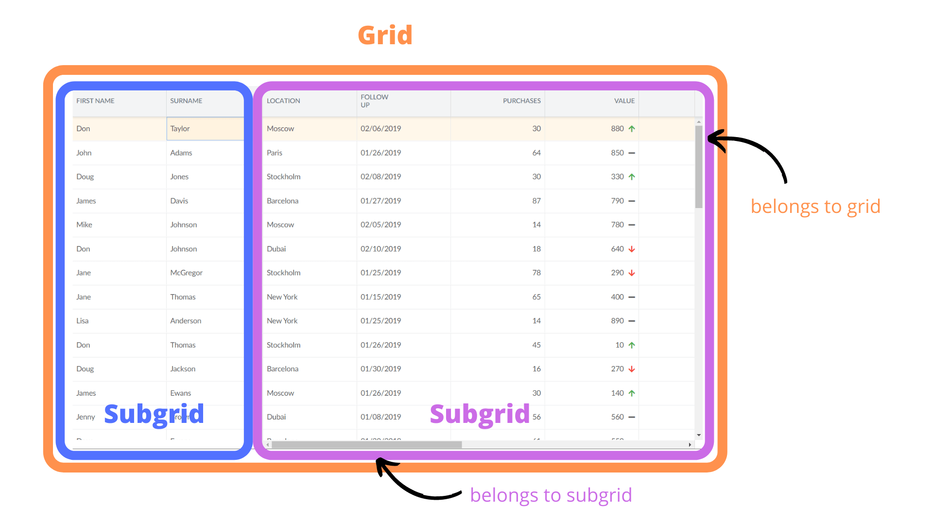
A grid consists of one or more subgrids, each with its own horizontal scroller. All subgrids share a vertical scroller.
Next steps
The best way to get started with Grid is by following one of our quick start guides, which provides step-by-step instructions. Once you're familiar with the basics, continue with the in-depth tutorial to explore advanced features. Choose your preferred technology below to begin:
Professional Services
Need help implementing or customizing Bryntum Grid? Don’t hesitate to request support from our Professional Services team.
Copyright and license
Copyright © 2009 - 2026, Bryntum
All rights reserved.