What’s New In Bryntum Grid 2.3

We are excited to announce version 2.3.0 of Bryntum Grid. This release is jam-packed with both big and small improvements. For full details please see the change log.
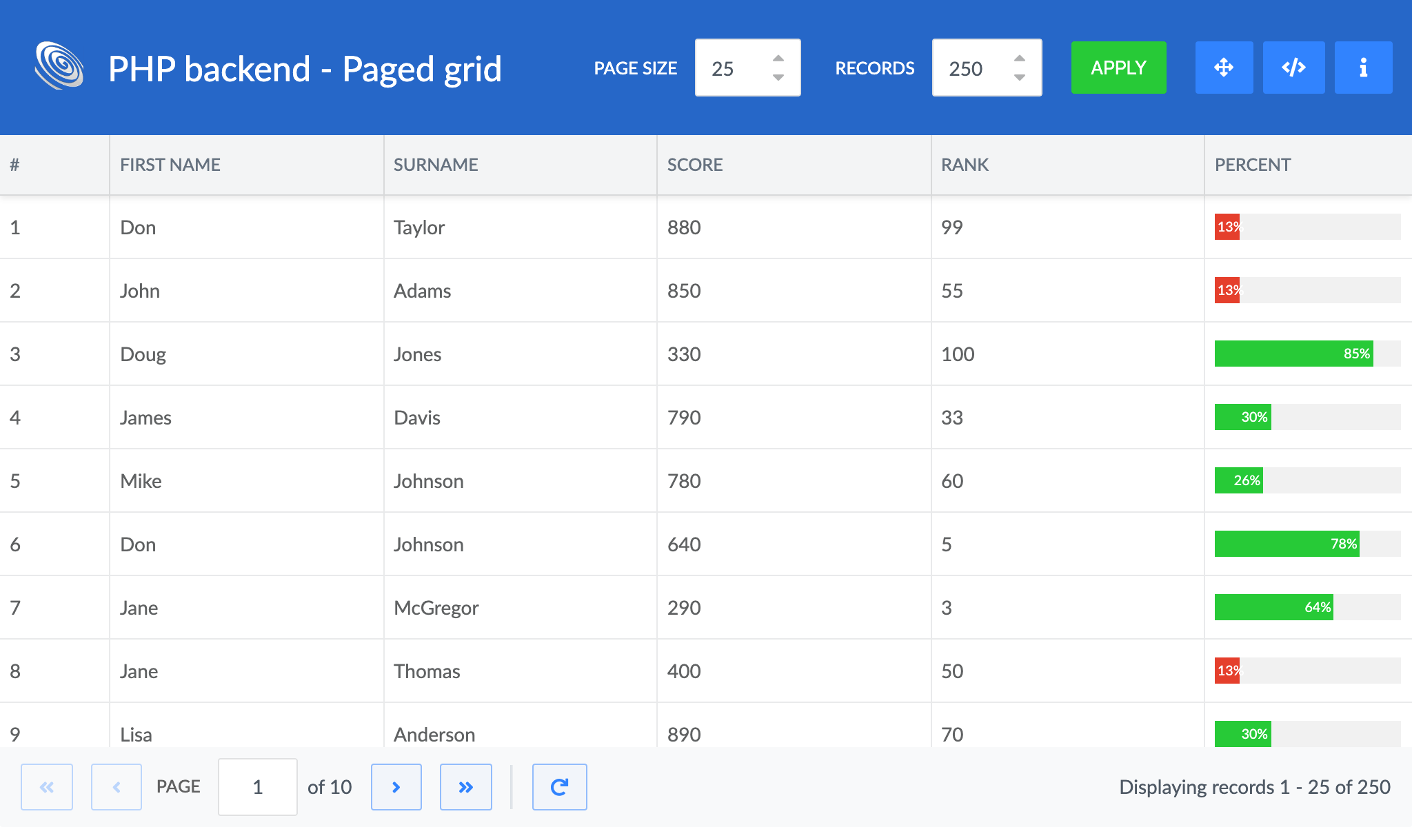
Paging support
While Grid is perfectly capable of handling really large datasets locally, it is not always practical to do so. With this release we are introducing paging support both in our Store and in the UI using a new PagingToolbar. Supporting paging also means that we now support remote sorting, grouping and filtering. Try it out in one of the new paging demos:
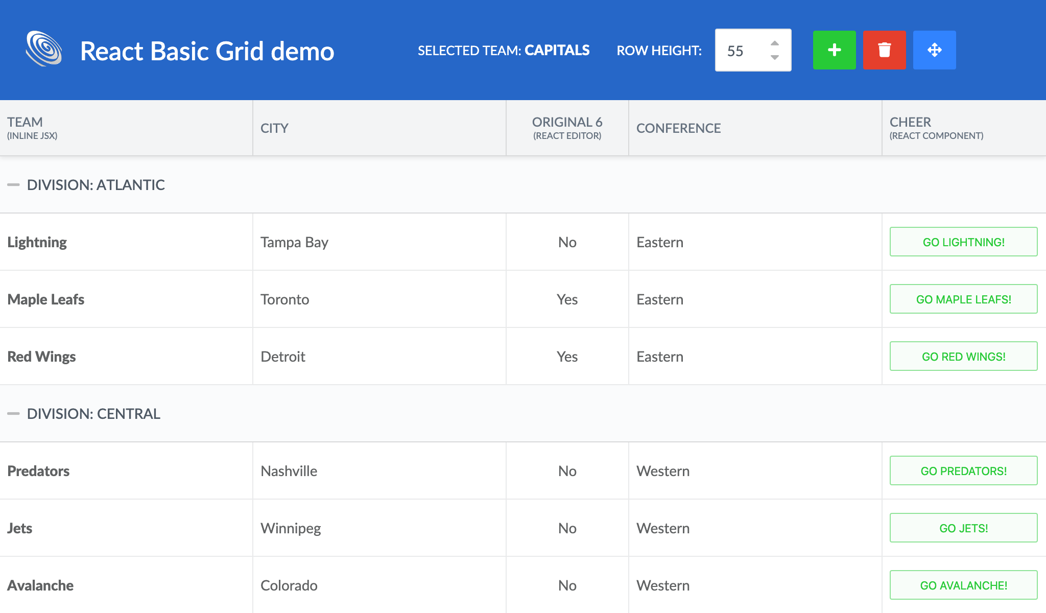
Experimental: JSX in renders and as cell editors
The React wrapper for Grid now supports using JSX/React components in cell renderers and as cell editors.
// A column using a custom React component in its renderer
{
  field    : 'team',
  text     : 'Cheer',
  renderer : ({ record }) =>
     this.handleButtonClick(record)}/>
}
Take a look at the updated React demos to see how it can be used:
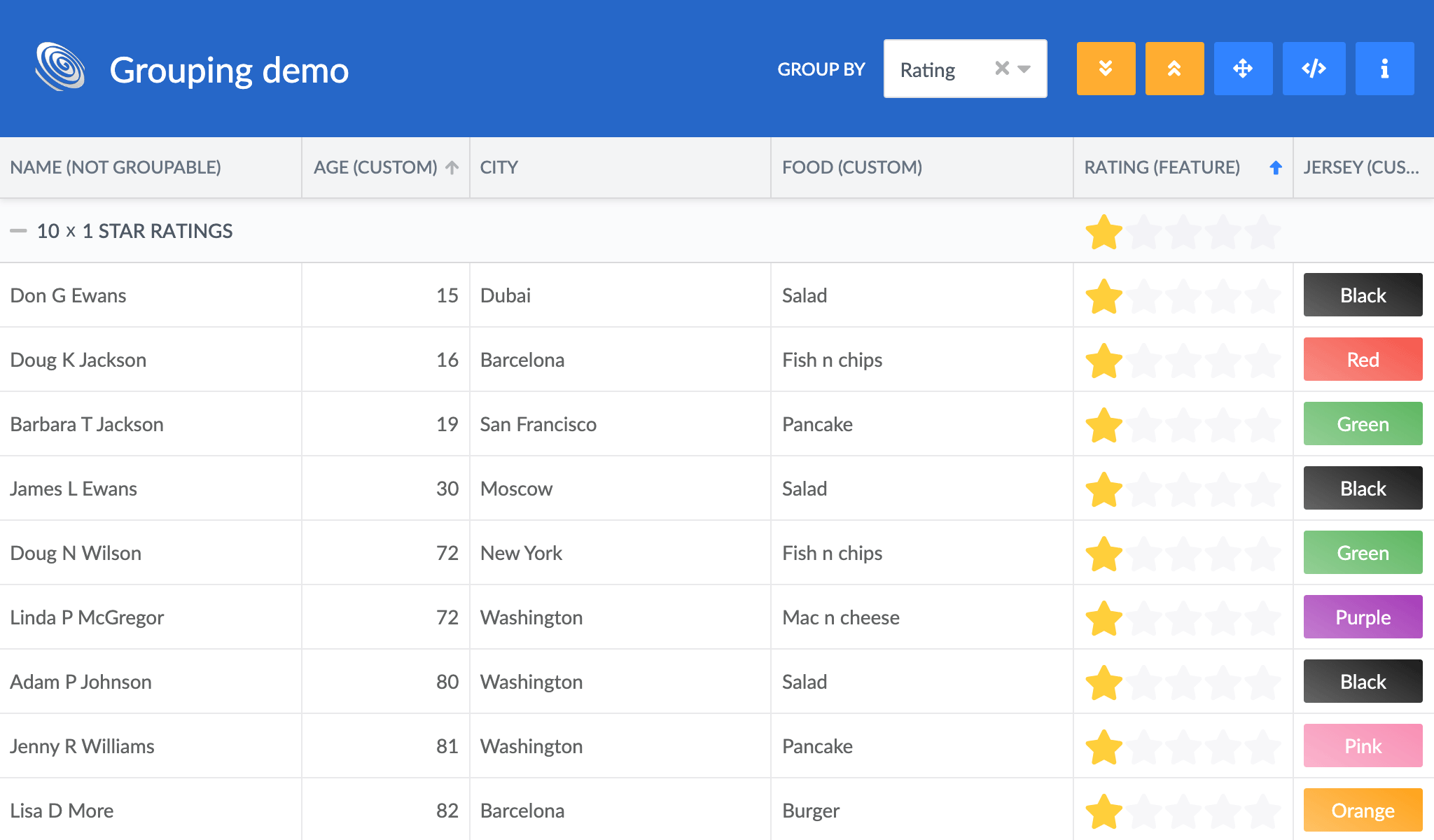
Content for all cells in a group header
The Group features `groupRenderer` can now populate all cells in a group header, as opposed to previously when it could only affect the first column. This opens up for greater flexibility as how to render group headers, try out the updated `grouping` demo to see it in action:
Custom builds
To simplify making custom builds from our sources there is now a new demo called “custom-build”. It uses WebPack to build a custom app + Grid bundle with smaller footprint than what you get with our full bundles. The demo uses a new base class for `Grid`, called `GridBase`. `GridBase` is basically the `Grid` without any default features imported, making the built result a bit smaller (approximately 30% if no features are used).
// Extending or instanciating GridBase instead of Grid makes custom builds smaller.
// But, any feature used have to be imported
import GridBase from 'lib/Grid/view/GridBase.js';
import Sort from 'lib/Grid/feature/Sort.js';

class MyGrid extends GridBase {
  features : {
    sort : true
  }
}
New Splitter widget
Our demos combining Grid and Scheduler or multiple Schedulers on the same page are very popular. A common request related to these demos have been how to make the different components resizable. To solve this we have added a basic Splitter widget. When added between two widgets (or other elements) it can be used to resize them.

Container improvements
Container and its subclasses now support:
- Adding and removing components dynamically, using `container.add/insert/remove/removeAll()`
- Getting the values of all contained fields, using `container.values`
- Checking if all container fields are valid, using `container.isValid`
Toggling features at runtime
All features except the Tree feature can now be enabled or disabled at runtime (assuming the feature was imported).
// Disable sorting using the UI
grid.features.sort.disabled = true;

// Re-enable it
grid.features.sort.disabled = false;
Data layer improvements
In addition to the paging support introduced above, Store now also has a new config to enable syncing the difference between a new dataset and a previously loaded one. By configuring a Store with `syncDataOnLoad: true` the new dataset will be compared to the old and only the changes will be applied (added, removed and modified records).
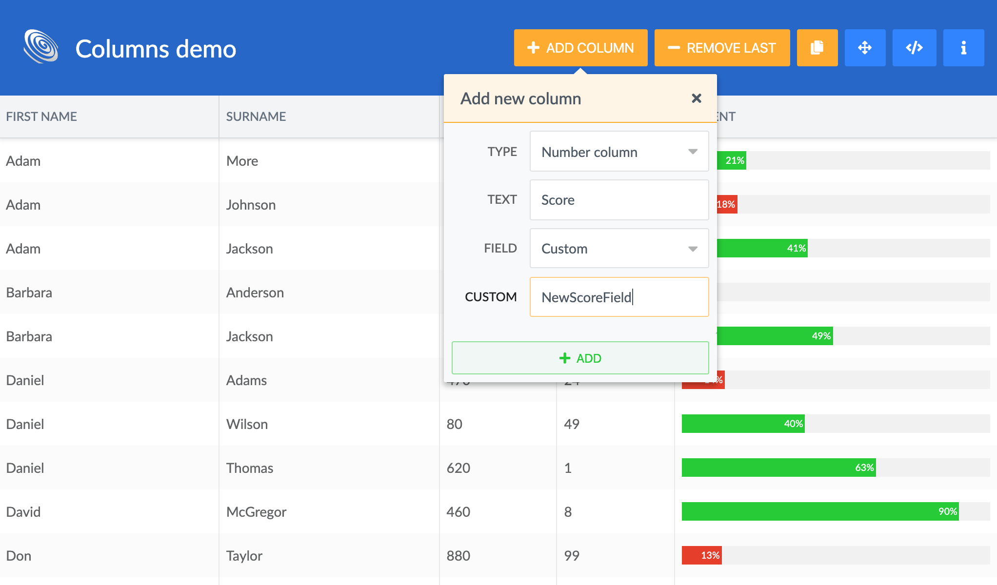
Model now allows adding and removing fields on the fly, using `Model.addField()` and `Model.removeField()`. This can be combined with configuring Grids ColumnStore with
`autoAddField: true` to automatically add fields for any new column. Try it out in the updated `columns` demo:
More small improvements
- Widgets can now `adopt` an element instead of appending itself to it, resulting in one less element on your page. Our demos have been adapted to use this new approach.
- A Grid using checkbox selection can now be configured with the new `rowCheckboxSelection` option to only toggle selection when clicking the checkboxes.
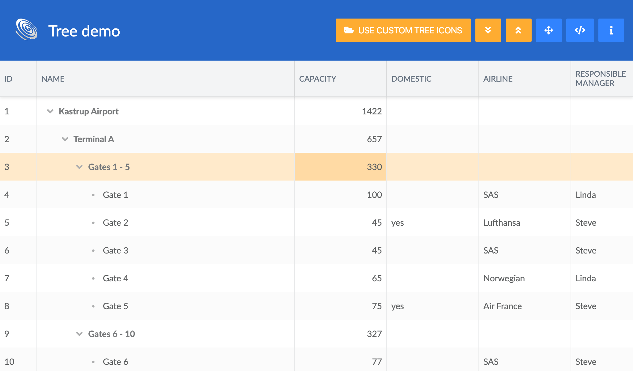
- The new AggregateColumn aggregates values from child nodes in a tree to the parents, to for example summarize costs, display an average salary or similar. On display in the update `tree` demo:
- The fields in the FilterBar feature can be customized using a `column.filterable.filterField` config. Try the City column in the updated `filterbar` demo:

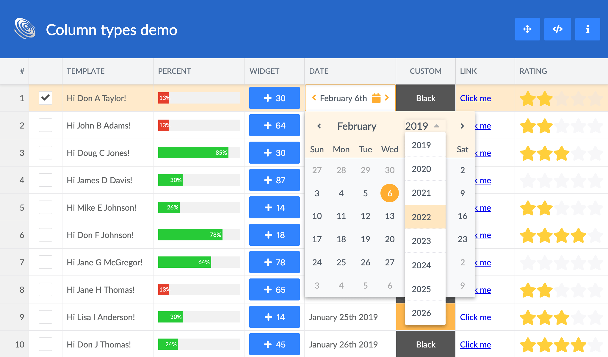
- The DatePicker used by our DateField has been improved to allow easily picking year and month. Click the year or the month to show a list to pick from:
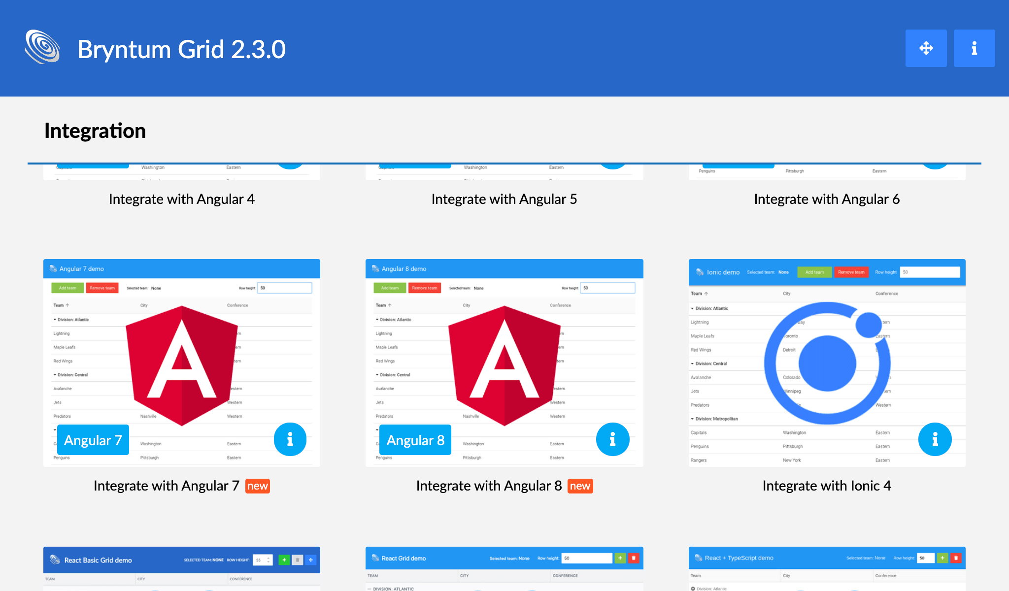
- This release also contains new Angular 7 & 8 demos:
Learn more
We hope you will enjoy all the new goodies in this release. For full details please see the change log.