What’s New In Bryntum Grid 1.2.0
We are super excited to announce the new 1.2 release of our Bryntum Grid component. Although this is strictly speaking a minor release by the semantic versioning convention, the release has lots of bug fixes and some really cool new features and enhancements. This blog post describes the bigger changes, for full details please see the change log.
Grid improvements
There were lots of improvements in different areas of the Grid code base this time around:
Typings for TypeScript
Typings are now generated from our docs and validated using the TypeScript compiler as a part of the release process. The result can be found at build/grid.d.ts and it is also included in the Angular demo and the new React + TypeScript demo. A small excerpt:
export class Grid extends Widget implements Events, Pluggable, State, GridElementEvents, GridFeatures, GridResponsive, GridSelection, GridState, GridSubGrids {
    // properties
    data: Array;
    readOnly: boolean;
    selectedRecords: Array|Array;
    store: Store|object;
    // functions
    deselectAll(): void;
    scrollCellIntoView(cellContext: object): void;
    scrollColumnIntoView(column: Column|string): void;
    scrollRowIntoView(recordOrId: Model|string|number, options?: object): Promise;
    selectCell(cellSelector: object, scrollIntoView?: boolean, addToSelection?: boolean, silent?: boolean): object;
    selectRange(fromId: string|number, toId: string|number): void;
    selectRow(recordOrId: any, scrollIntoView?: boolean, addToSelection?: boolean): void;
}
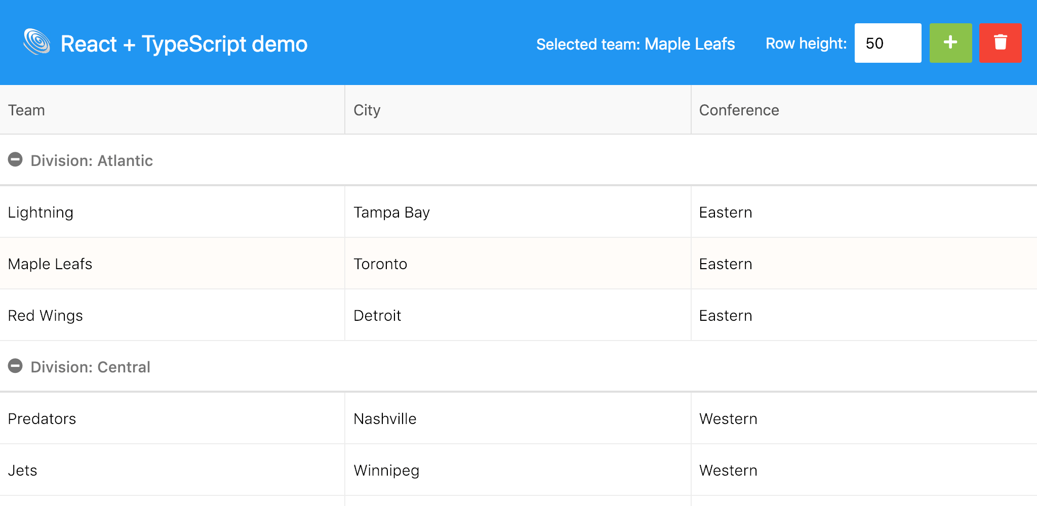
React + TypeScript demo
A new demo using a tsx version of our React wrapper. It requires building and cannot be viewed online, but simply download the trial and follow the steps in README.md to get it running.
Custom column
The columntypes demo was extended with a custom Column subclass. When you need to create a custom column, all you need to do is extend the built-in Column and provid your own column type and renderer:
// Define your own column type
class ReverseColumn extends Column {
    static get type() {
        return 'reverse';
    }

    renderer({ value }) {
        return value.split('').reverse().join('');
    }
}
// Register with ColumnStore to make the column available to the grid
ColumnStore.registerColumnType(ReverseColumn);
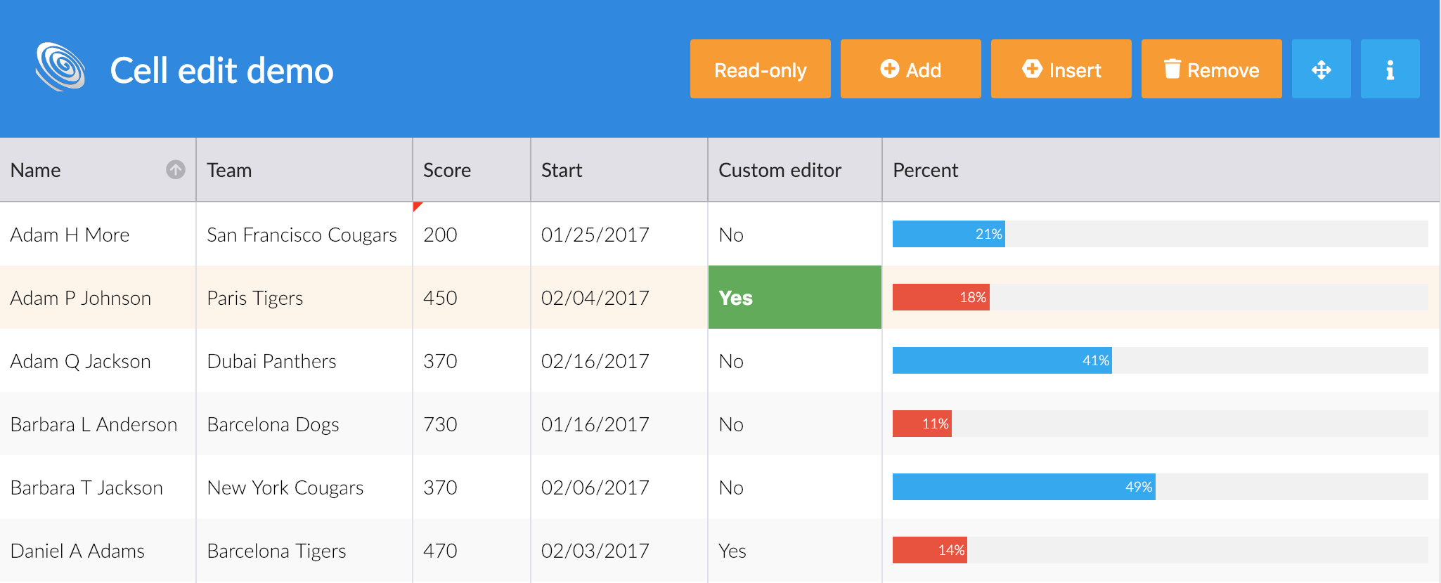
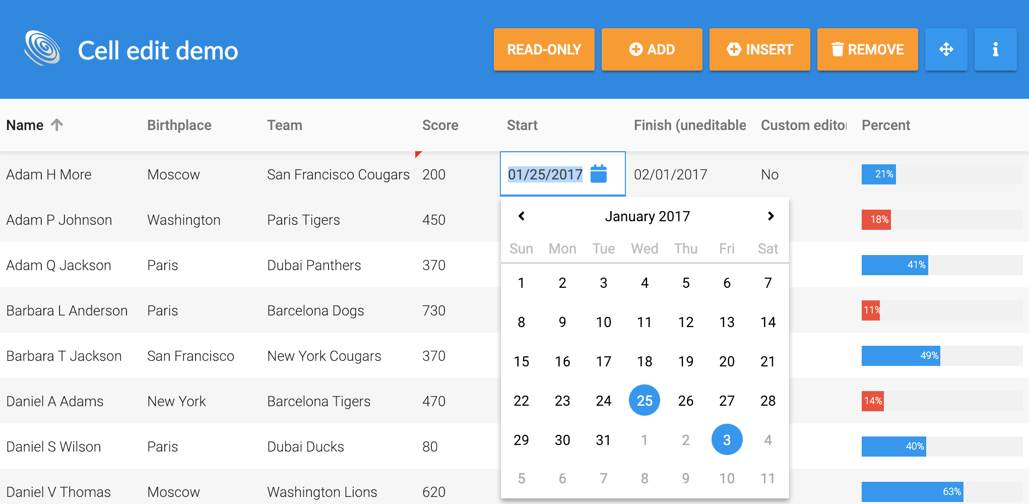
Custom editor
In a similar manner, the celledit demo was extended to show a custom editor. This is a little more complex than the custom column, be sure to check out the sources for the demo to see how it is done.
Localised sorting
Sorting can now optionally be localised using localeCompare(). It is not used by default since it is a bit costly performance wise, but for locales other than English it might be worth it. The sorting behavior can be configured on Store, sorter and Column levels. For example, to use Swedish sorting for all sorters on a Store:
const store = new Store({
    useLocaleCompare : 'sv-SE',
    data : [
        { letter : 'ö' },
        { letter : 'å' },
        { letter : 'ä' }
    ]
});
store.sort('letter'); // -> åäö, without localeCompare it would yield faulty äåö
Improved state handling
The Grid supports serialising and restoring its state to/from a JSON object. The application can then save it to LocalStorage or a backend database, allowing for example a custom view for a user or letting the user continue with the settings he was using when returning later. In this release we have extended what is stored in this state object, it now includes the following (* is new):
- Scroll position, for all sections*
- Width of sections*
- Full selection*
- Column states: width, visibility, order
- Store state: sorting, grouping, filtering*
You can try it out in the state demo:

Preventable “before” events on Store
The following “before” events are now available on Store:
They are all preventable, meaning that if you return false from a listener, it will prevent the action. This can for example be used to validate data before allowing an update:
store.on('beforeupdate', ({record, toSet}) => toSet.age > 20); // No youngstersA new date picker
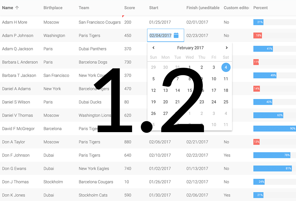
Flatpickr was replaced as our date picker of choice by a new one developed internally. While still short on features compared to flatpickr, this change will give us more options moving forward and as soon as we have our own time picker as well, we will remove our last external JavaScript dependency (yay!).
Additional improvements
- The built in version of FontAwesome was bumped to 5.5.0
- Cell editing can be configured to start editing on type as in Excel (
startEditOnCharacterPress) - A new guide was added describing how to listen to events (read it here)
- The Store class now throws an error when it detects duplicate ids in the data loaded
Learn more
For full details please see the change log.