Road to 3.0: Making the Ext Scheduler Responsive
In modern web apps, supporting responsive layouts has become very important due to the varying screen sizes across desktop, mobile and tablet devices. The new Ext JS 5 platform has really nice support for responsive rendering out of the box.

What does ‘responsive’ mean?
On Wikipedia, we can learn the following definition of Responsive Web Design:
Responsive Web Design (RWD) is a web design approach aimed at crafting sites to provide an optimal viewing experience—easy reading and navigation with a minimum of resizing, panning, and scrolling—across a wide range of devices (from mobile phones to desktop computer monitors).
While “traditional” RWD is normally using grid layouts and percentage based sizing coupled with CSS3 media queries, Sencha uses a more JavaScript oriented approach. The reason for this is that Ext JS has its own layout engine and doesn’t rely much on the browser CSS engine for layouting. This approach means that you can easily run any JS when the size of the viewport changes, to adapt your user interface. Let’s see how this works.
The new ‘responsiveConfig’
The responsive functionality is provided by the Ext.mixin.Responsive mixin. This mixin is activated anytime you add the Ext.plugin.Responsive plugin to a Component. Here’s a basic sample of how it can be used:
[crayon striped=”false” lang=”js” nums=”false” toolbar=”false”]
Ext.create({
xtype: ‘viewport’,
layout: ‘border’,
items: [{
title: ‘Some Title’,
plugins: ‘responsive’,
responsiveConfig: {
‘width < 800': {
region: 'north'
},
'width >= 800′: {
region: ‘west’
}
}
}]
});
[/crayon]
The code above will render the panel to the ‘north’ section if the viewport width is less than 800px, and ‘west’ otherwise. Anytime the viewport width is changed, these conditions are reevaluated and the corresponding set methods are called for the properties (setRegion in this case). So how can we make something cool with this feature for the Ext Scheduler component? I think setting the orientation based on the device orientation is a good start. Here’s how the code would look:
[crayon striped=”false” lang=”js” nums=”false” toolbar=”false”]
new Sch.panel.SchedulerGrid({
…,
plugins : [
‘responsive’
],
responsiveConfig : {
“width
}
});
[/crayon]
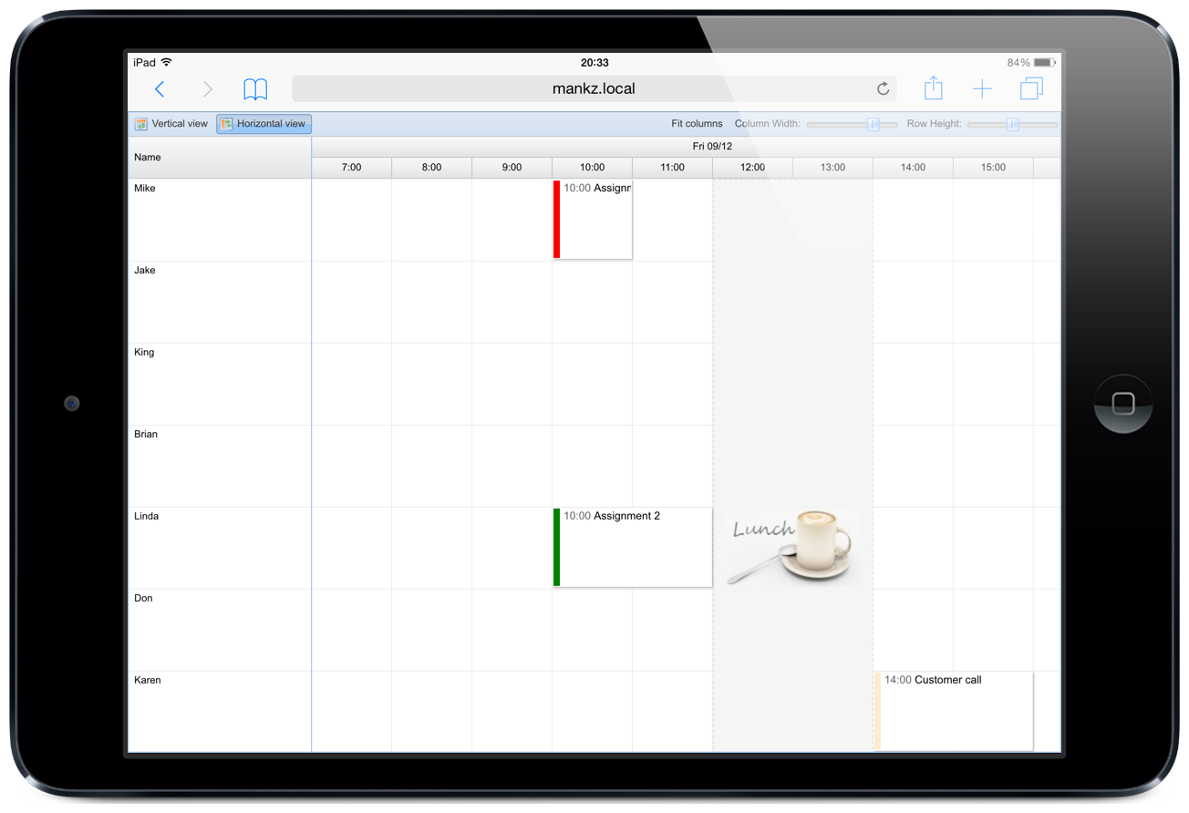
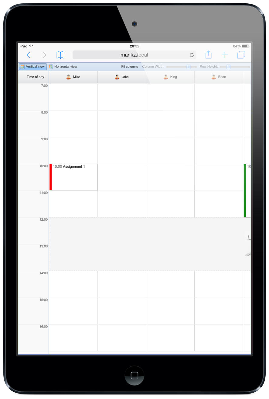
As you can see, we simply change the ‘mode’ property (meaning setMode will be called) when device orientation changes from landscape to portrait and vice versa. In total, about 5 lines to get that working – not bad. Here’s how it looks:
Landscape – Horizontal
Portrait – Vertical
This is just a simple example of what you can do, you can change any properties easily by having setter methods with corresponding names (setRowHeight, setTimeColumnWidth etc). Let’s take it a bit further now. We can change other properties too for smaller screen sizes. To change row height and column display, here’s all you have to do:
[crayon striped=”false” lang=”js” nums=”false” toolbar=”false”]
new Sch.panel.SchedulerGrid({
columns : [
{
text : ‘Name’,
width : 200,
dataIndex : ‘Name’,
plugins : ‘responsive’,
responsiveConfig : {
“width
}
}
],
plugins : ‘responsive’,
responsiveConfig : {
“width
}
});
[/crayon]
Summing up…
We hope you’re convinced of how easy it is to add responsive rendering support to your application. It really only takes a few lines of code, that’s all. Happy hacking!